
Overview
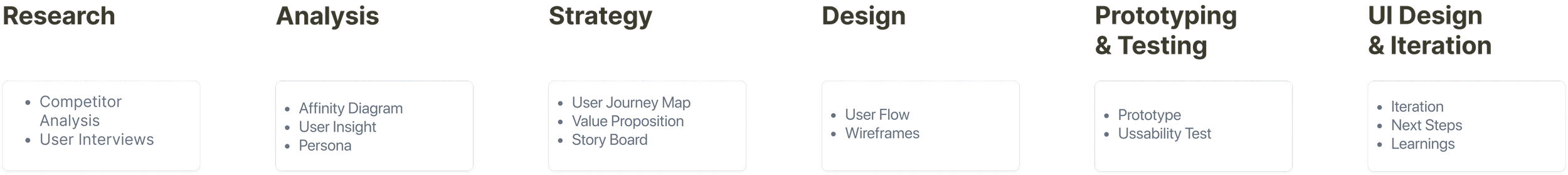
UX Design
User Research
Persona
Usability Test
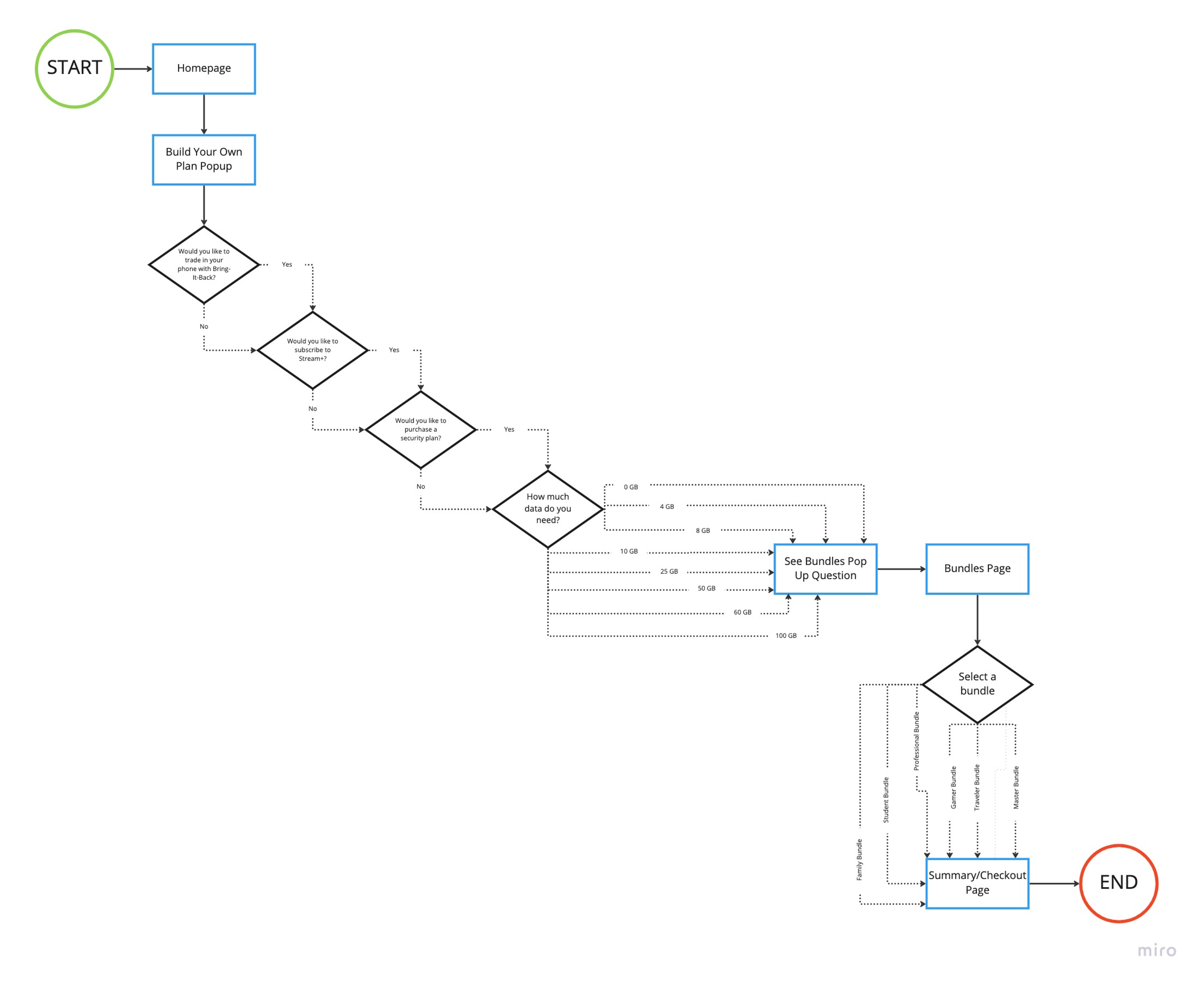
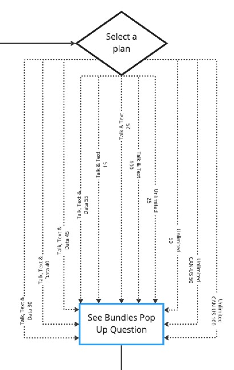
User Flow
Card Sorting
Context
Single Project
Design in 4 weeks
improve the overall navigation in a way that provides easy access to information and creates a cohesive, user-friendly experience.
UI Design
Wireframing
Prototyping
Iteration
Tools
Figma
FigJam
Zoom
Trello
Slack
My Role
UX/UI Designer
Problem Statement
Users are often frustrated with confusing navigation systems, inaccessible information, and resources when they visit the website.
Solution
Focus on optimizing the navigation system and user flow to facilitate a smooth, easy, and simple experiences for the users.
creating a side by side comparison and bundles to reinforce that users are getting the best deal(s) for them.
Adding visuals such as images and icons to increase readability.
optimizing navigation and user flow to guide users to information efficiently.
Rewording or summarizing texts and description to ensure users can understand what the service actually includes.
Heuristic Evaluation
By conducting a heuristic evaluation, my team and I were able to identify inconsistencies throughout the website. It provided a foundation for improving the experience. It gave us a direction to find a problem and build a solution.
User Story
Our user is looking into buying a new iPhone and a better & more affordable plan. They’re still upset with the Rogers network outage a few months ago. They’re not sure what company to go with. And they come across the Telus website and see the new feature. They take the survey to discover which plan is best for them. And ends up choosing the Telus Professional Plan Bundle. They also like that Telus has reliable 5G network across Canada.
Survey Results
To understand our users better, we sent out a survey and collected data from over 200 people across Canada.
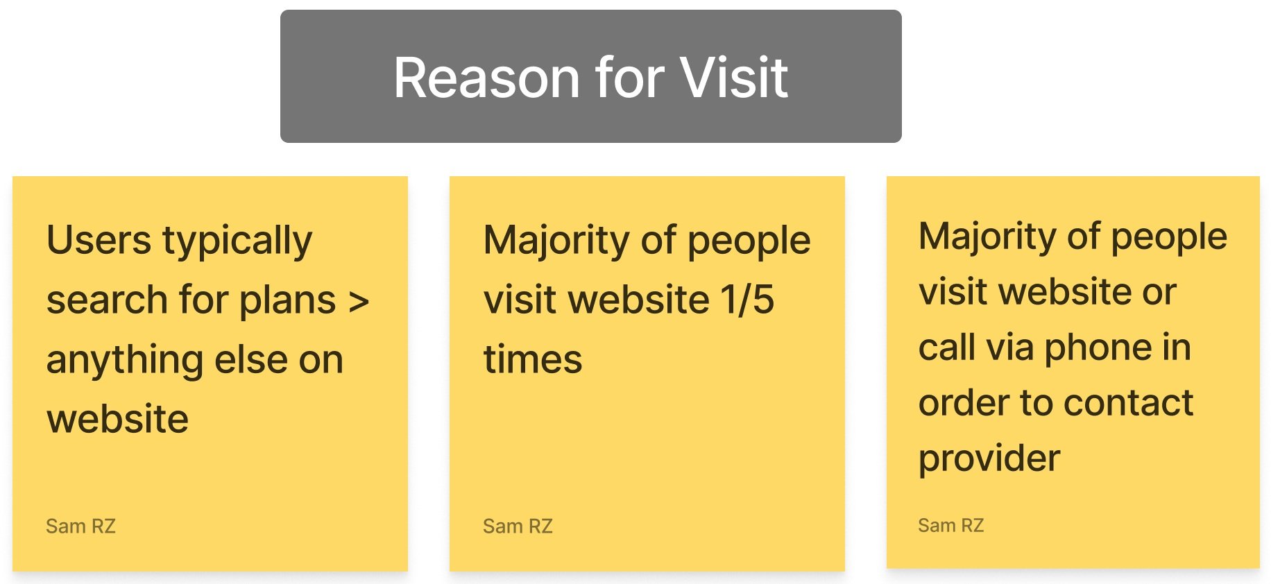
We found that the top 3 competitors for Telus are Rogers, Bell and Freedom. The majority of the users visit their service provider’s website to look at plans. Almost all users felt better plan and/or price would convince them to switch providers.
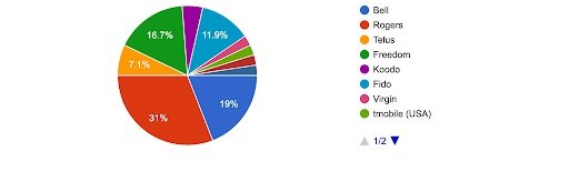
Who is your current service provider?

What are you most likely to look for when visiting your service provider’s website?
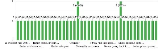
What (if anything) would convince you to switch to a different service provider?
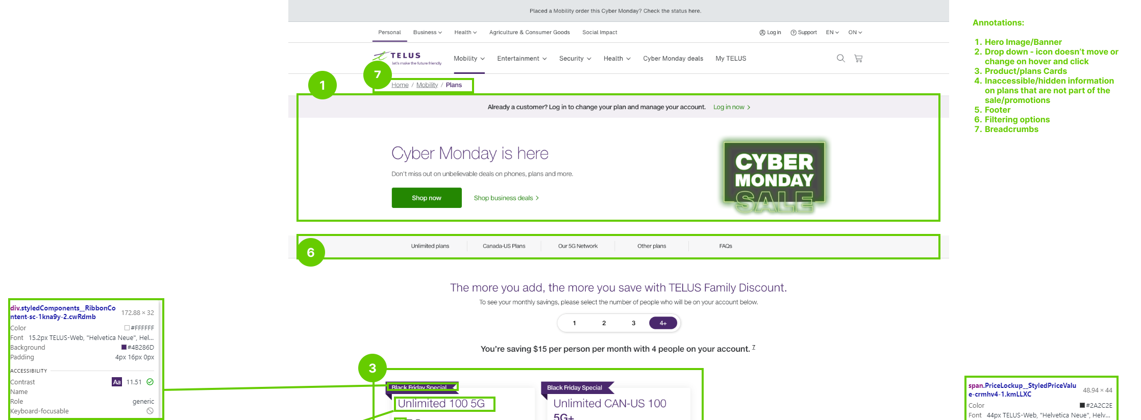
Usability Testing For The Original Site
Conducted an unmoderated usability test with 4 tasks on 5 participants. The test results would be translated into an Affinity Diagram and an Empathy Map. Helps articulate the critical usability issues. Understand the difficulty of navigating through and purchasing a phone plan. To analyze what parts of the website/links the user clicks on to successfully purchase a phone plan.
Objective
Identify the usability issues with the primary and secondary navigation
identify use frustrations when searching for information
identify accessibility issues across the UI system
Questions That Want to Be Answered
Is the user able to easily find information on phone plans?
Is the user able to find a protection plan for their phone?
Is the user able to seek support via the virtual assistant chat bar?
Is the user able to find information about donating their old phone?
Affinity Diagram


We took all the research data, including data from our usability tests and organized it into relevant categories.
Everyone wants cheaper and better plan regardless of current phone company
Navigation bar was confusing for most users
All users were frustrated with organization of plans and promotions across the website
All users were guessing and assuming where the information should be which was not always correct


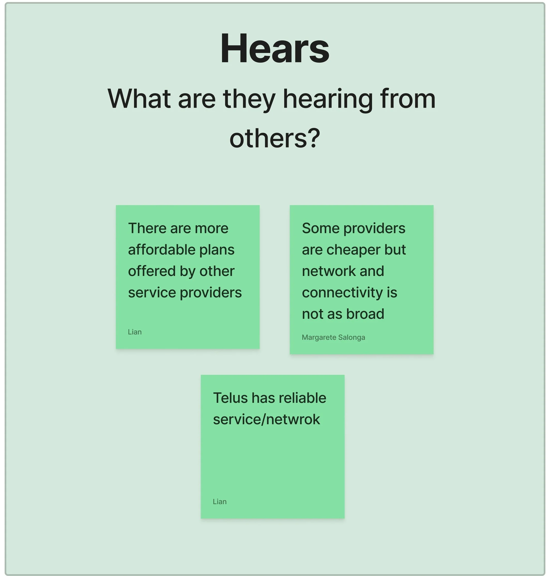
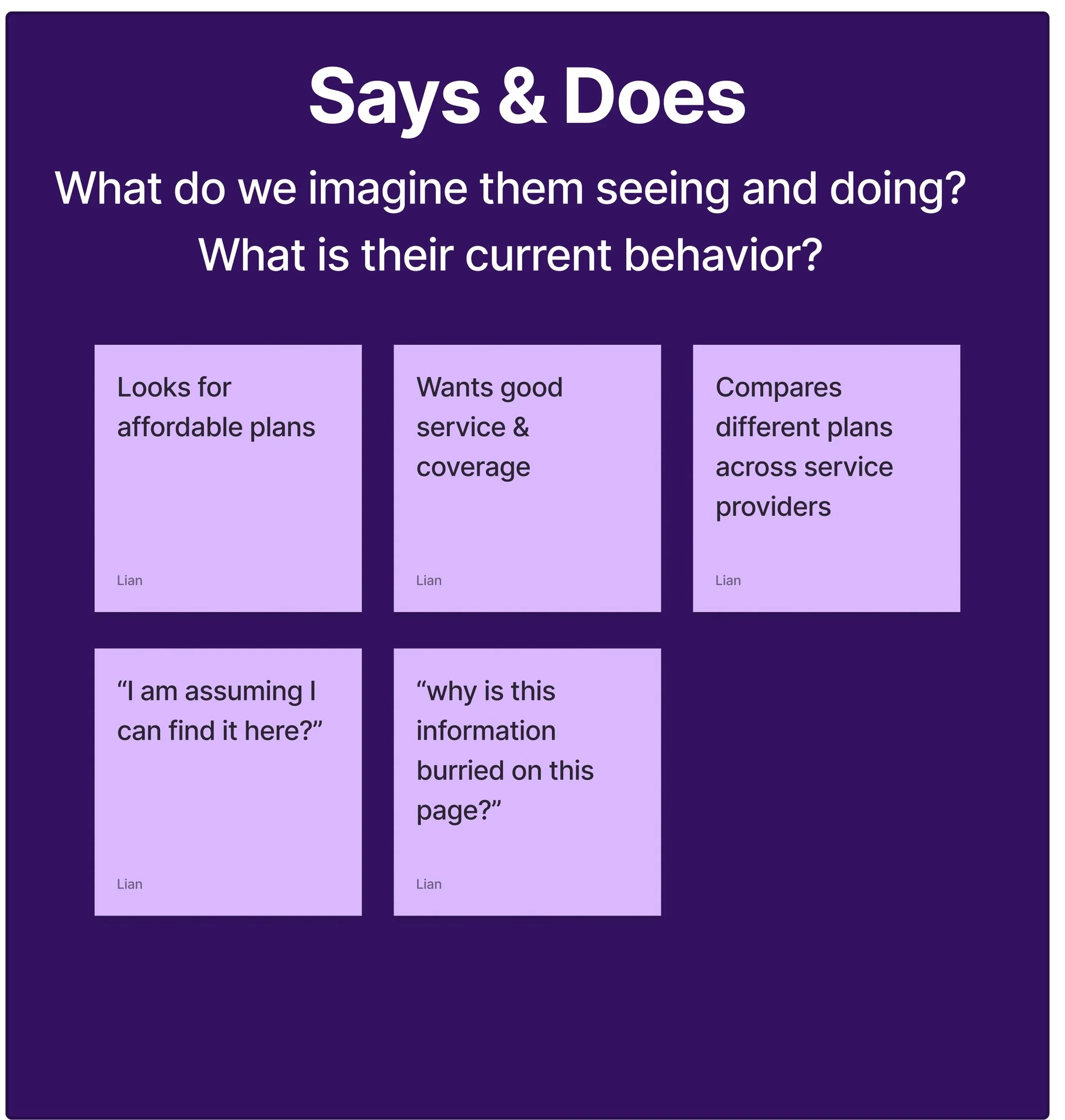
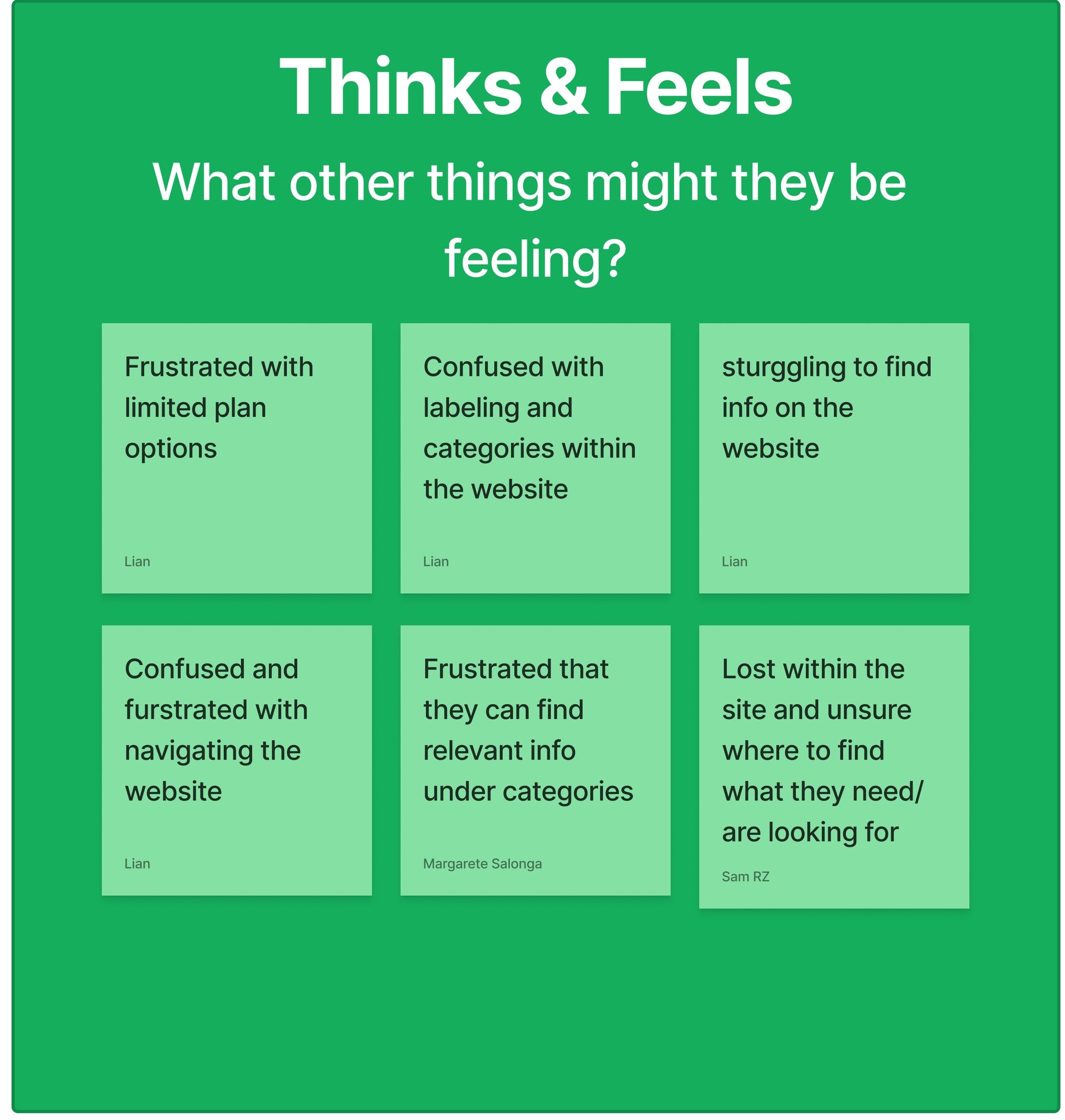
Empathy Map
To gain a deeper insight to the customer experience, we created an Empathy Map
Users see too many ads on the homepage
Users hear that other providers offer more affordable plans
Users question where to find specific information and therefore just guess
Users feel there are limited plan options

How might we help users find the right plan quickly?
So that our users are successful based on easily accessible information with high legibility and clarity.
How might we avoid guessing and confusion while users are using the navigation system?
So that our users are successful based on using an efficient navigation system to find what they are looking for on the website.
User Flow
Main User Tasks
Select phone/plan option
Select a phone/plan
Select accompanying phone/plan
Check out
Main KPI: decreased time from phone/plan selection to checkout.
Style Guide

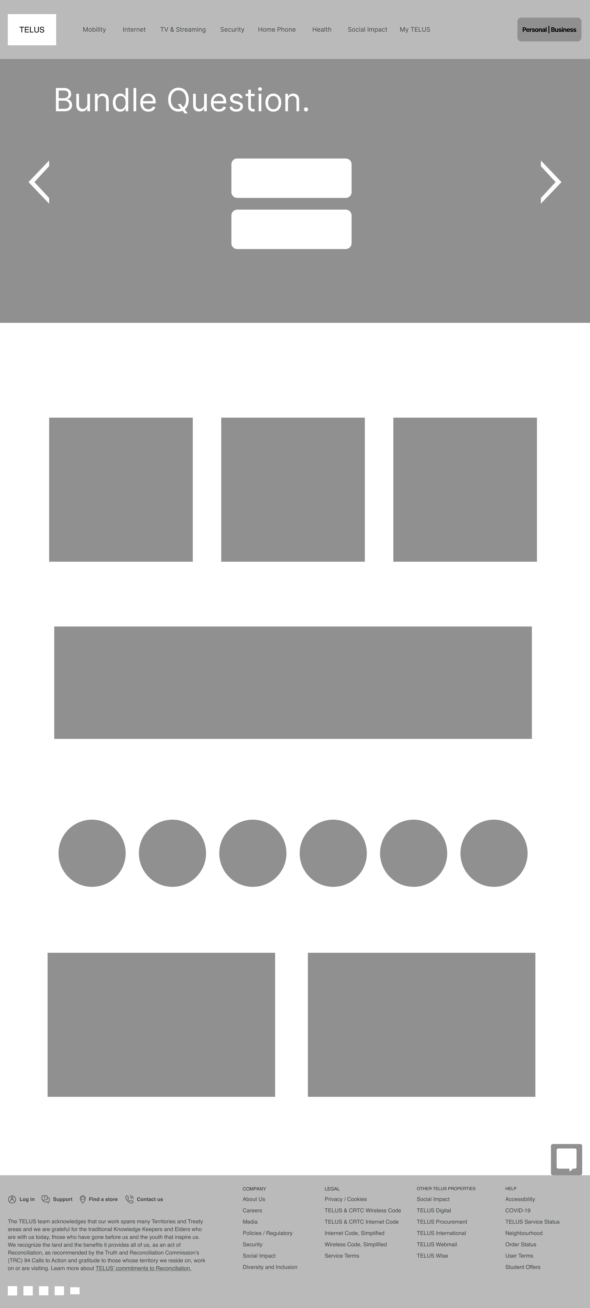
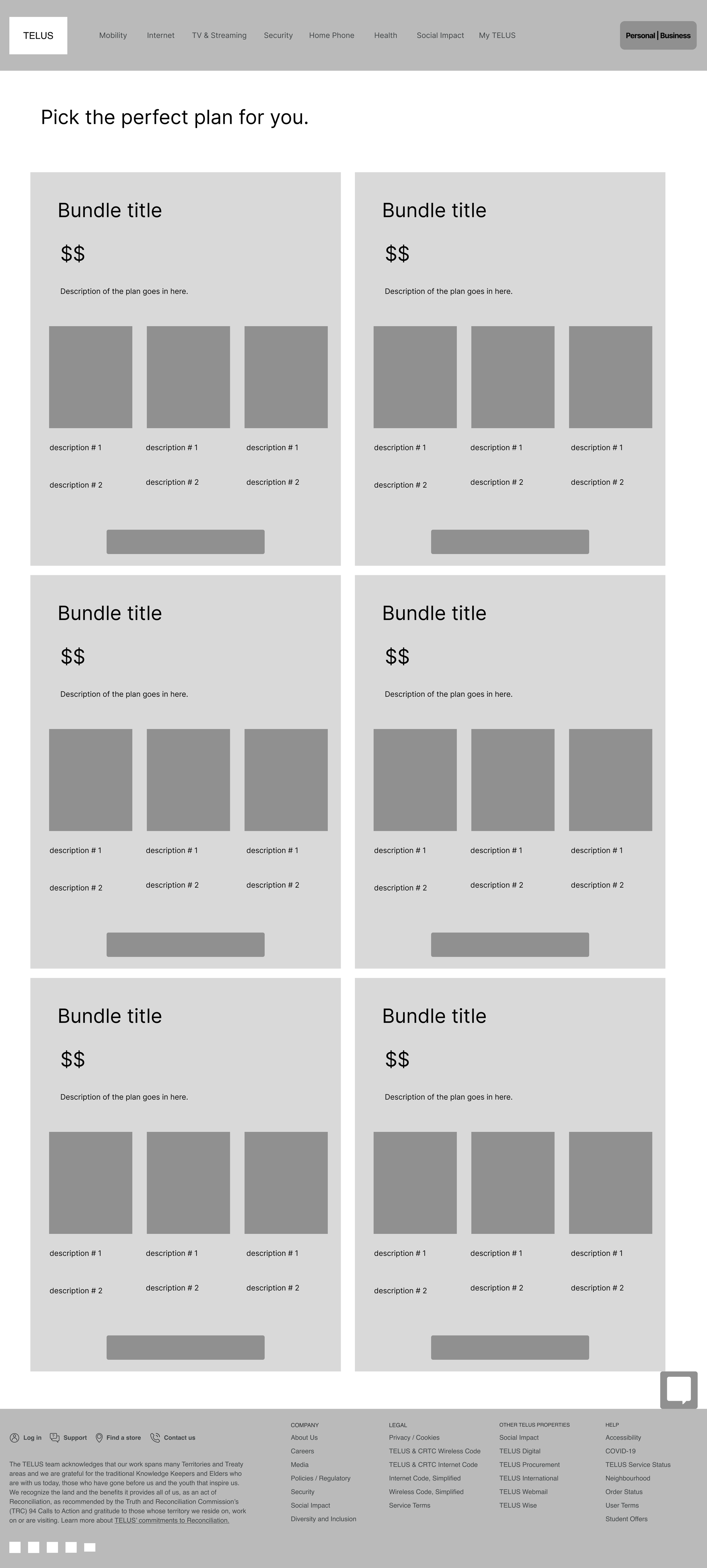
Low-Fidelity Wireframe


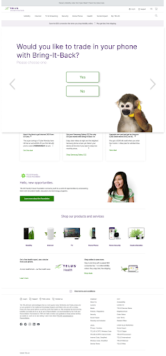
Homepage
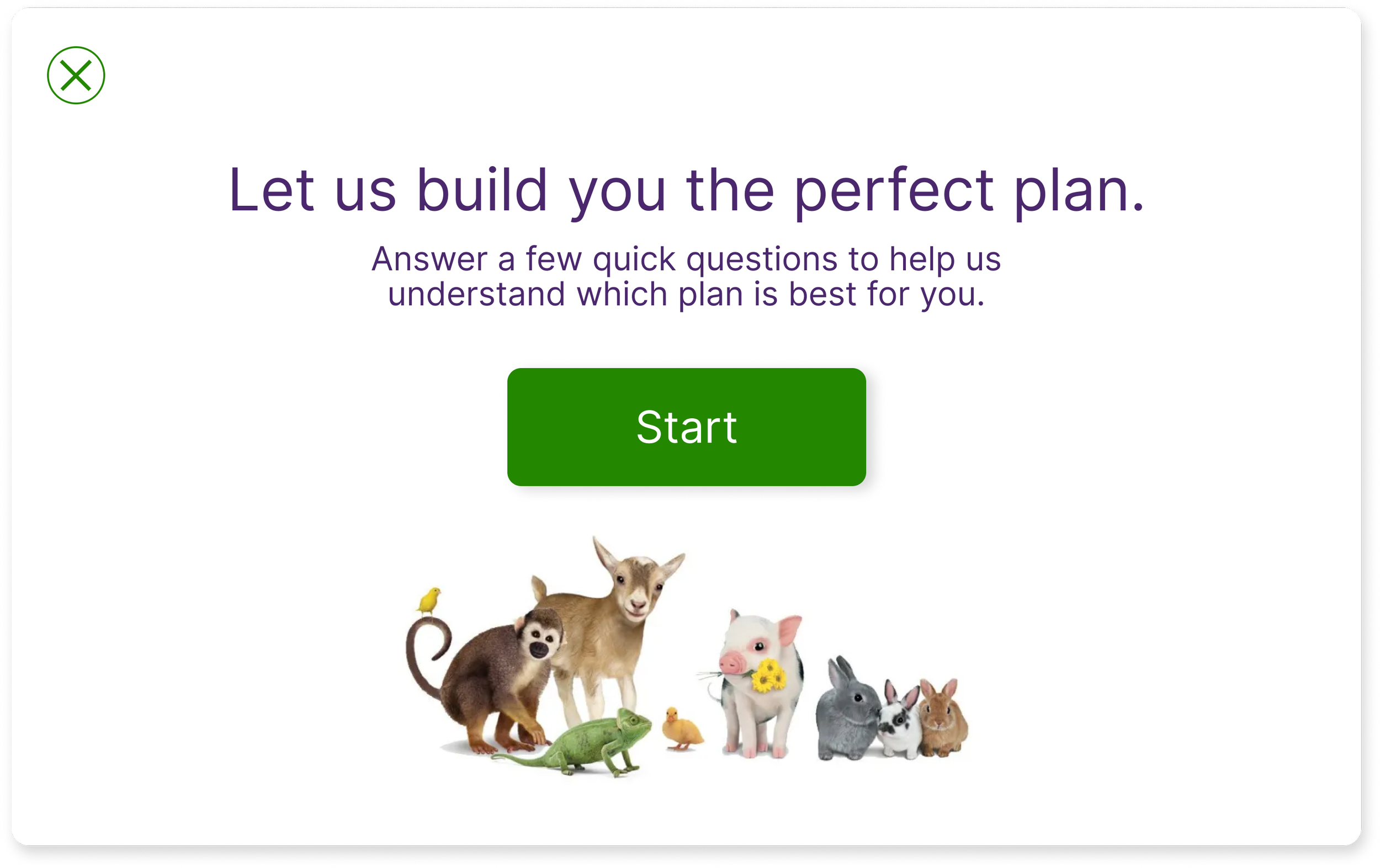
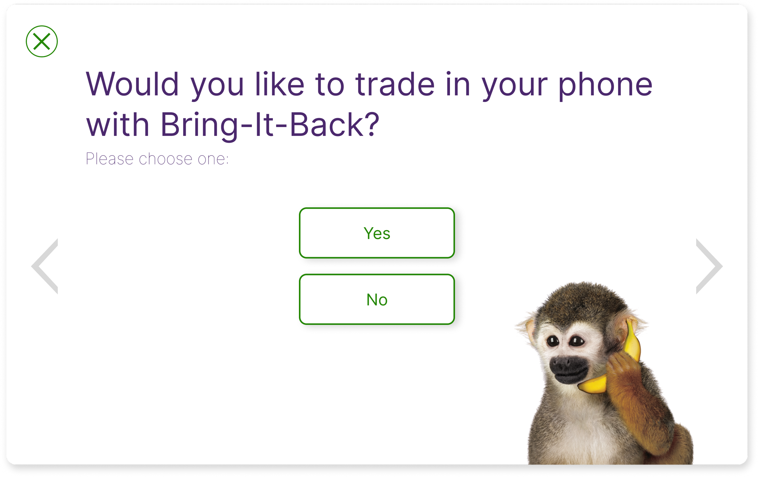
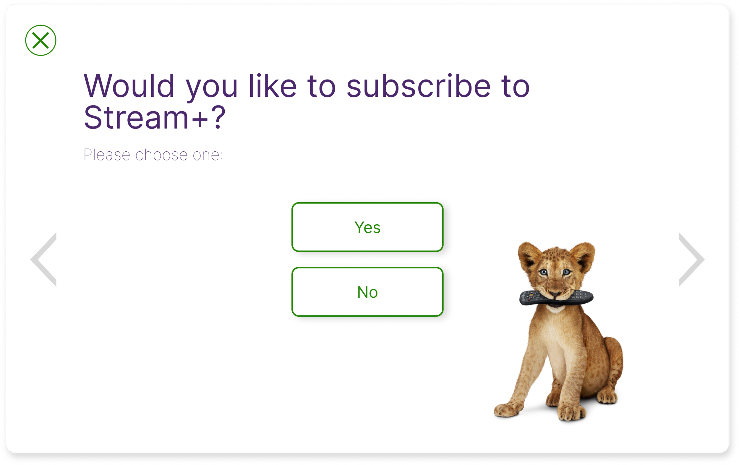
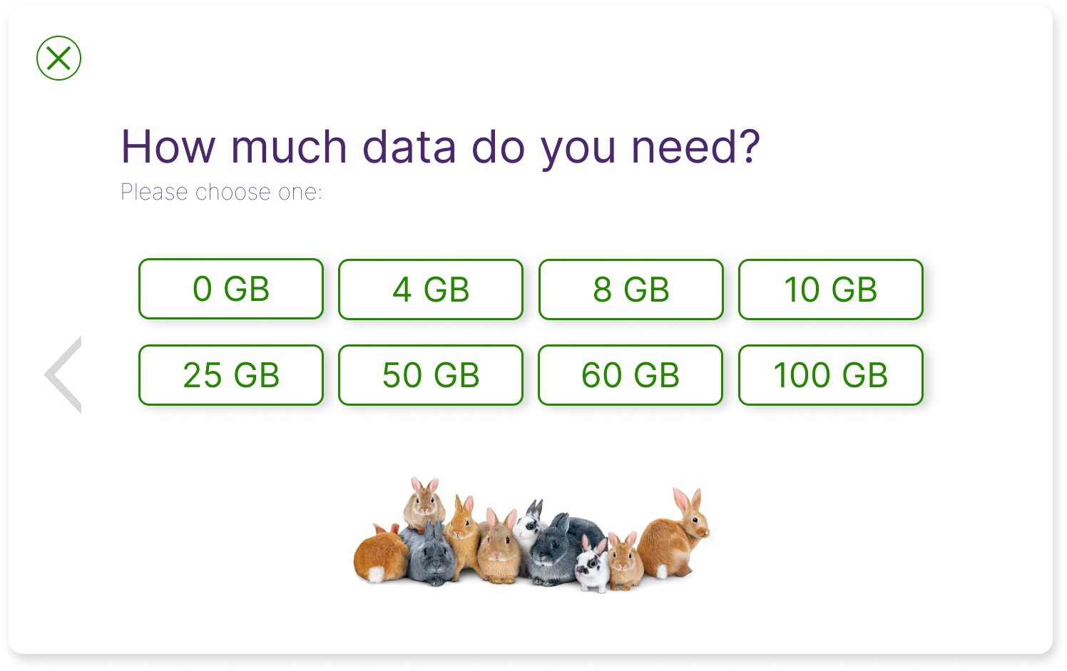
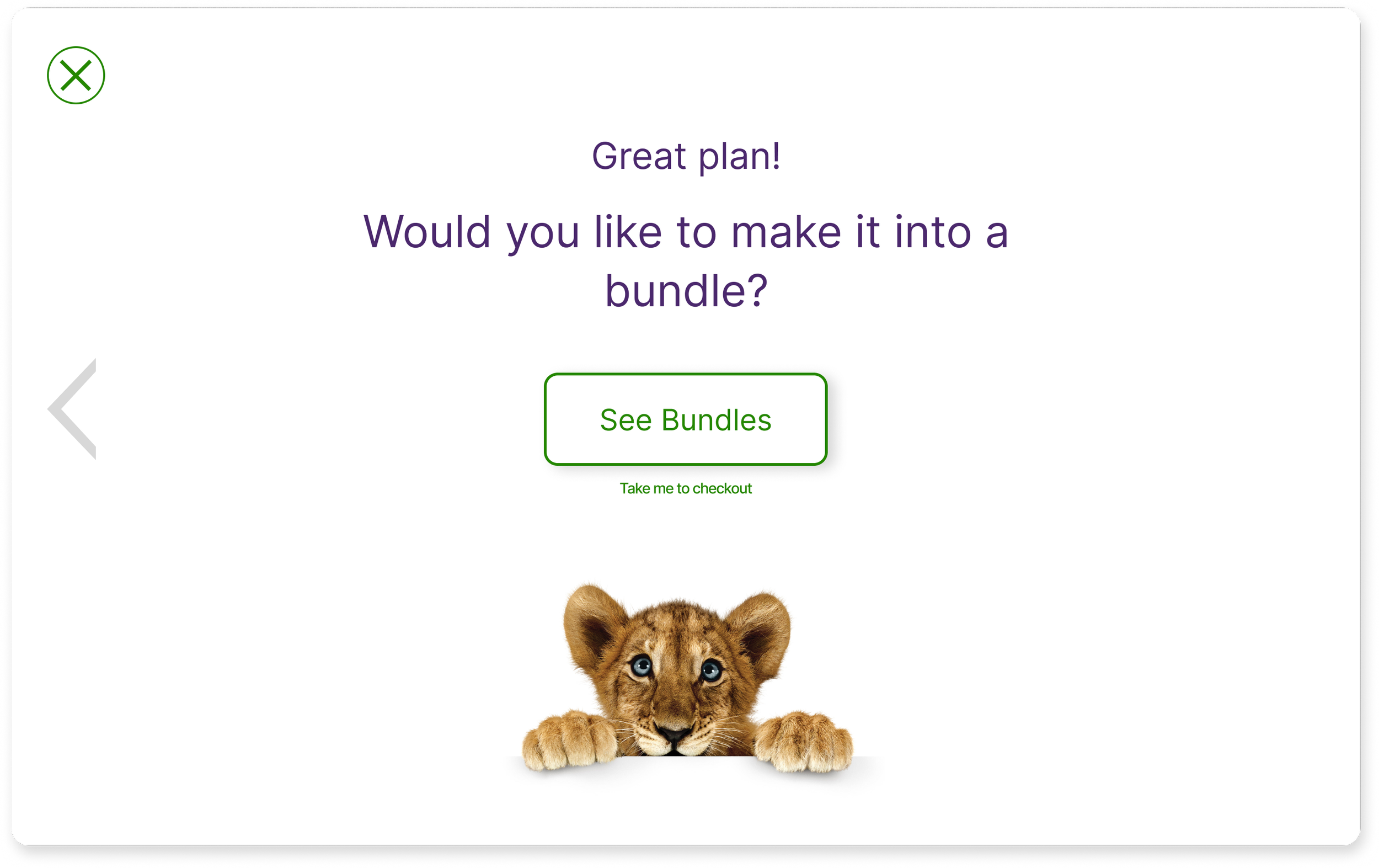
Bundle Questions
(Hero image)
Bundle Page
Summary Page
A/B Testing

The difference: the addition of the Recommended Plan(s) Page and the option for the user to select their preferred plan. This is based on the results of the “Build Your Own Plan” questionnaire
User Flow A
User Flow B
Iterations
Hero image animation
Pop-up screens
Exit option within questionnaires

Moved too quickly
took away focus from feature in hero image
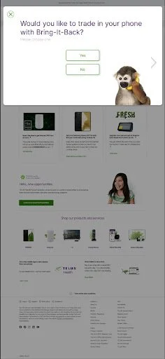
Before
After
Unclear that survey was a pop up
Took up too much room on the screen
Exit option within questionnaires
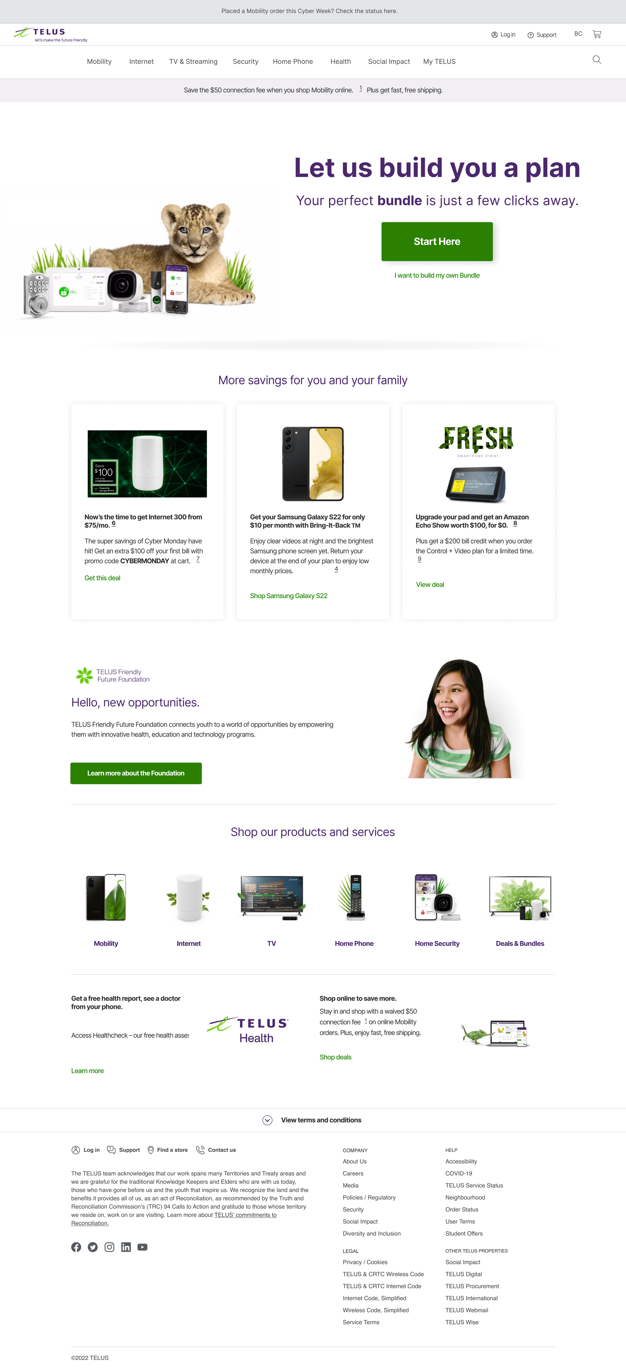
High-Fidelity Wireframe


Key Takeaways
Main challenge was focusing on the feature that is mainly based on our users’ need rather than solely focusing on marketing ideas.
It was also difficult to keep my biases out of the design process and not get too caught up with our own opinions and what we want from a Canadian phone company.
Next Steps
Develop a comprehensive navigation bar including elements from the secondary navigation instead of only keeping the primary one.
Optimize the new feature to have a responsive web design (RWD) to make the site more dynamic when the users are using it on a different device.